Sunday, September 26, 2010

Oh, The Great Outdoors

Outdoor ads don't necessarily have to be billboard ads. I have a great sense of respect for those who use the resources of the great outdoors to their advantage in order to send a message. Some of the best outdoor ads are placed strategically in locations that one wouldn't think to be typical - which automatically gives the ad a better chance of catching someone's eye. My favorite part about outdoor ads is the most successful ones tend to make the viewer do a double take: the very premise of this blog. Case in point:


Sure, these are ads for a strip club in Paris, but the creativity of placement is what amazes me. Lamp posts as stripper poles? Brilliant use of an existing structure, a normal everyday object used to the advertisers advantage. Talk about doing a double take if you were to see this.


This ad is for Nike (obviously), but what's interesting is that I wish I could see it in real life. On the website, it says its a "transparent" outdoor ad. But is it a piece of plexiglass that you can just see through, or a metal border with nothing in the middle so you can actually run through it (I think I'd like it better if it were the latter). But imaging what the thought process must have been behind this - "Let's just through a billboard in the middle of the road, that'll make people stop and ponder it." You're damn right it will.


This ad is for Rejoice DeTangling shampoo. Again, commonplace structure already present in everyday life (massive amounts of electric wires) creatively used to portray the essential simple message of an outdoor ad.

This could be dangerous to install, though.

Just some food for thought.

Sunday, September 19, 2010

Silence can be a virtue...sometimes.

So this weeks blogs is ads without words, and sometimes I think ads without words are sometimes the best ones out there. In order to have a successful word-less ad, your concept has to be so simple and clear that words aren't necessary in order to portray the intended message. Here are some good ones that use the technique well:

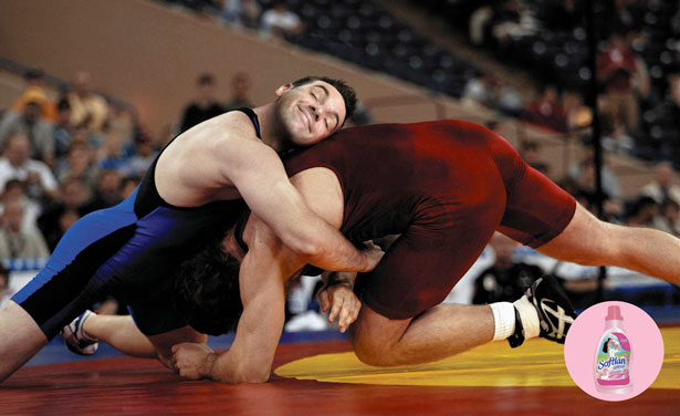
 This ad is for fabric softener. Not even a tagline is used here, because the concept is so apparent that this fabric softener smells so good that the wrestler in blue just gets lost in the scent. Simple, easy message that comes across with just visuals. Now yeah, the concepts a bit overdone (Febreze essentially monopolized this with their TV commercials, backflipping dog and massive TV, etc) which is unfortunate, because without the logo this could very well be mistaken for a Febreze ad (or any other product that makes your fabric smell good), but you win some, you lose some. The point is, it's executed nicely without using words.

Not gonna lie, I laughed at this one. Which is good, right? The tagline ties it all in together - "Fits Naturally" - oranges being a natural food. Ads that make you laugh are probably high up on the scale of the most effective ones, and ads this simple that make you laugh are just a double whammy. Memorable, with a beautifully executed, clear message. A+, Wonderbra.


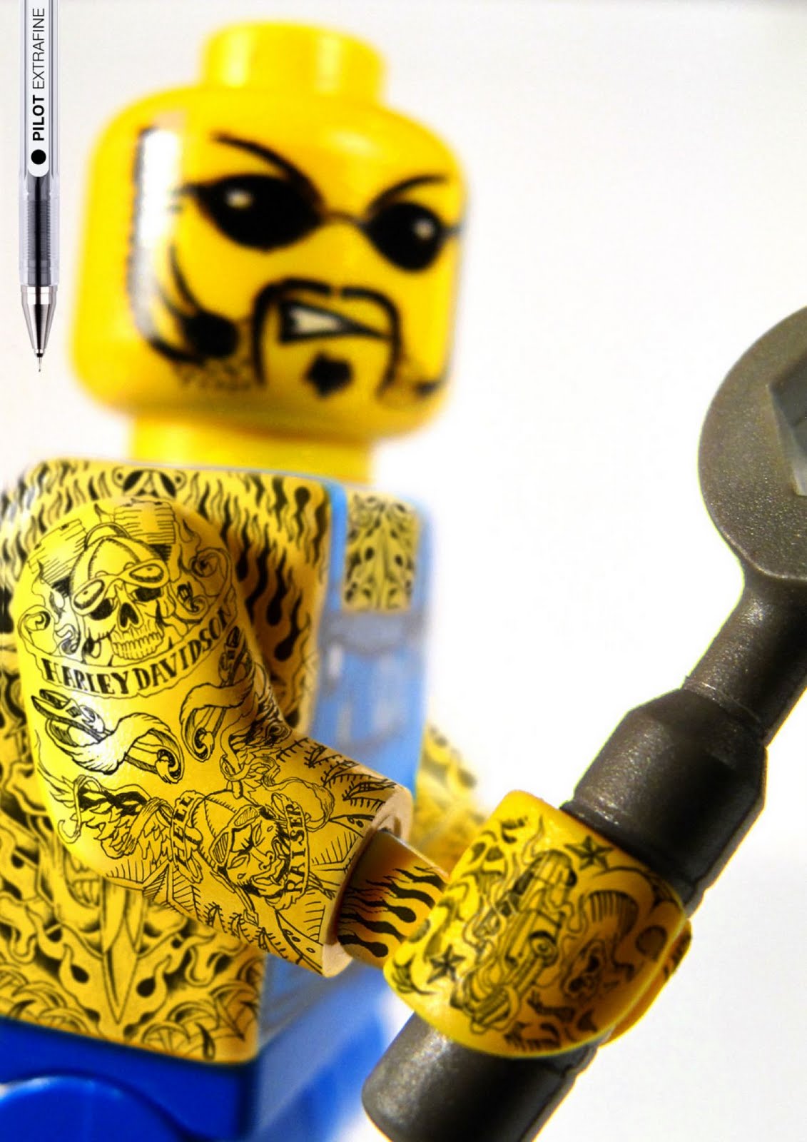
Pilot Extra Fine - so precise, you can draw incredibly intricate and detailed tattoos on a Lego guy...if that's what you like to do with your free time. Not to belabor the point because I think we all get it by now...simple. Easy to understand. Great composition as far as execution goes.


Unfortunately, there are some ads out there where words would probably come in handy, yet are absent. Take this 3M Scotch double-sided tape ad...

 I don't know, maybe I'm just out of the loop, but I don't get what double-sided tape has to do with 69...making a sexual reference like this without a clear message and no words to explain yourself can be a very risky thing to do.

Using words in your ads doesn't necessarily mean your concept sucks because it can't speak for itself. The trick is just knowing when you don't need words, and when you should probably use them (because some ads just need a little bit more explanation in order to clear up any grey area - are you listening 3M?)

Just some food for thought.

Thursday, September 16, 2010

VW: doing it right since the 60's (and probably even before then)

I love VW. I love them as a brand, as a product line, as a company, and as a community.
I also love them as an advertiser.
I am constantly re-convinced again and again that VW, and whatever agency they've been using, knows what they're doing. Take a look at these ads they did in the 1960's, specifically the copy.


Even back in the 1960's, VW knew how to sell cars. They knew how to be remarkable - they knew how to be purple cows, if not purely by virtue of the product they were selling, then by making the product seem like a purple cow through their advertising.

And they're still doing it to this day. To be completely honest, I just pulled the first VW print ad I came across, because if I spent any considerable amount of time trying to find one of my favorites, I'd be here all night, get distracted, and never actually post this.


They've moved their focus from long copy to short and sweet, but it works. Everything works.

As far as German manufacturers go, BMW should take a page out of VW's book.
Just some food for thought.

I like junk food more than I like these ads.

I came across these ads on my Tumblr. Clever way of changing the product, for sure. But I'm not so sure it's all that believable (especially for a junk foodie like me). How exactly DD smoothies affect the way we look at other snacks escapes me. Granted, the tiny copy at the bottom infers that they're better for you, blah blah blah, but everyone knows what you're biting into when you open that bag of Doritos - calories, artifical coloring and flavoring, and a bunch of other unhealthy additives.


The fact of the matter is, I don't think DD attacking the junk food market is a smart idea. They might be better off attacking other health foods (maybe? who knows.) I'm just not convinced.

Some (literal) food for thought.

Sunday, September 12, 2010

Tactical Ops

The following is possibly one of my favorite ads. I'm sure we've all seen it in the past, whether in Sheehan's class or elsewhere. Regardless, it's a great example of changing the product...well, they didn't actually change or manipulate the product in a huge way, but upon looking at it we all know what it's supposed to be, as well as what the product actually is.


Fiery Fries.
French fry looks like a matchstick. Hot french fries. Spicy french fries from Burger King. Bam, message received.
Beautifully simple copy, art direction, and creative message. Now that's my kind of ad. 


This next ad takes a bit more thought, however the technique of storytelling is what makes it work


This ad is for a music festival in the South called The Garage, which specifically showcases only up-and-coming artists and bands who are either struggling to secure a recording deal for one reason or another or are just having a hard time getting discovered. These are the three ads in the campaign that I've seen, each one showing a beat up, damaged musical instrument, which is meant to tell the story of music that is struggling to make it through yet keeps getting beaten up by the world. The copy encourages you to look for more information on The Garage (and possibly attend the festival) in order to "Keep Music Alive".


This next ad employs the tactic of omission and suggestion. All it shows you is the stem of the pepper, from which you can infer that the pepper has been eaten. And thanks to Alka Seltzer - no heartburn!


However, after doing a double take (cough-connection to blog name-cough =]) and reading the copy, this ad makes you wonder. "Removes the source of heartburn fast" - does that mean the person was able to eat the pepper without worrying about heartburn...or did the Alka Seltzer eliminate the pepper so that all that was deemed safe to eat would be the stem - therefore removing the temptation of eating the pepper and consequently removing the threat of heartburn? I'm sure that's not what Alka Seltzer intended, but...

just some food for thought.

Wednesday, September 8, 2010

Ikea: not so simple after all?

Now, I'm going to start off by saying that I've never owned anything from Ikea. I've never stepped foot in an Ikea store (however I hear that because of this I'm completely missing out on one of god's gifts to the world). At the same time, I was always under the impression that the name "Ikea" was synonymous with good quality and an incredible experience from start to finish - which in my (apparently delusional) mind translated into easy assembly.

From the following ads, however, Ikea seems to be taking a more humble approach in admitting that yes, you might need help putting together some of their stuff. But have no fear! Ikea Assembly Service to the rescue!

Regardless of my preconceived notions that Ikea's furniture was supposed to magically appear, fully assembled in your fifth floor apartment that conveniently has no access to an elevator, I find these ads for the Ikea Assembly Service clever, simple, and refreshing.


Now I pose this question to you: is it a good idea for Ikea to portray the assembly of their products as so complicated that one would NEED a service such as this (that you most likely have to pay extra for). I mean, look at the instructions and the parts lying scattered across the floor in each ad - in the last one it looks like someone stabbed the screwdriver into the floor out of frustration. I don't know about you, but the last thing I would want to do is buy a product from somewhere that would require me to pay for an extra service to help me assemble it, or risk pulling my hair out and throwing around profanities.  After doing a double take at these ads and really dissecting the message Ikea is giving out, while they might be creative and entertaining, are they really going to benefit Ikea in the long run?

Just some food for thought.

Tuesday, September 7, 2010

Sarah's got a blog!

...hopefully this turns out to be more interesting than previous attempts at maintaining one of these things.